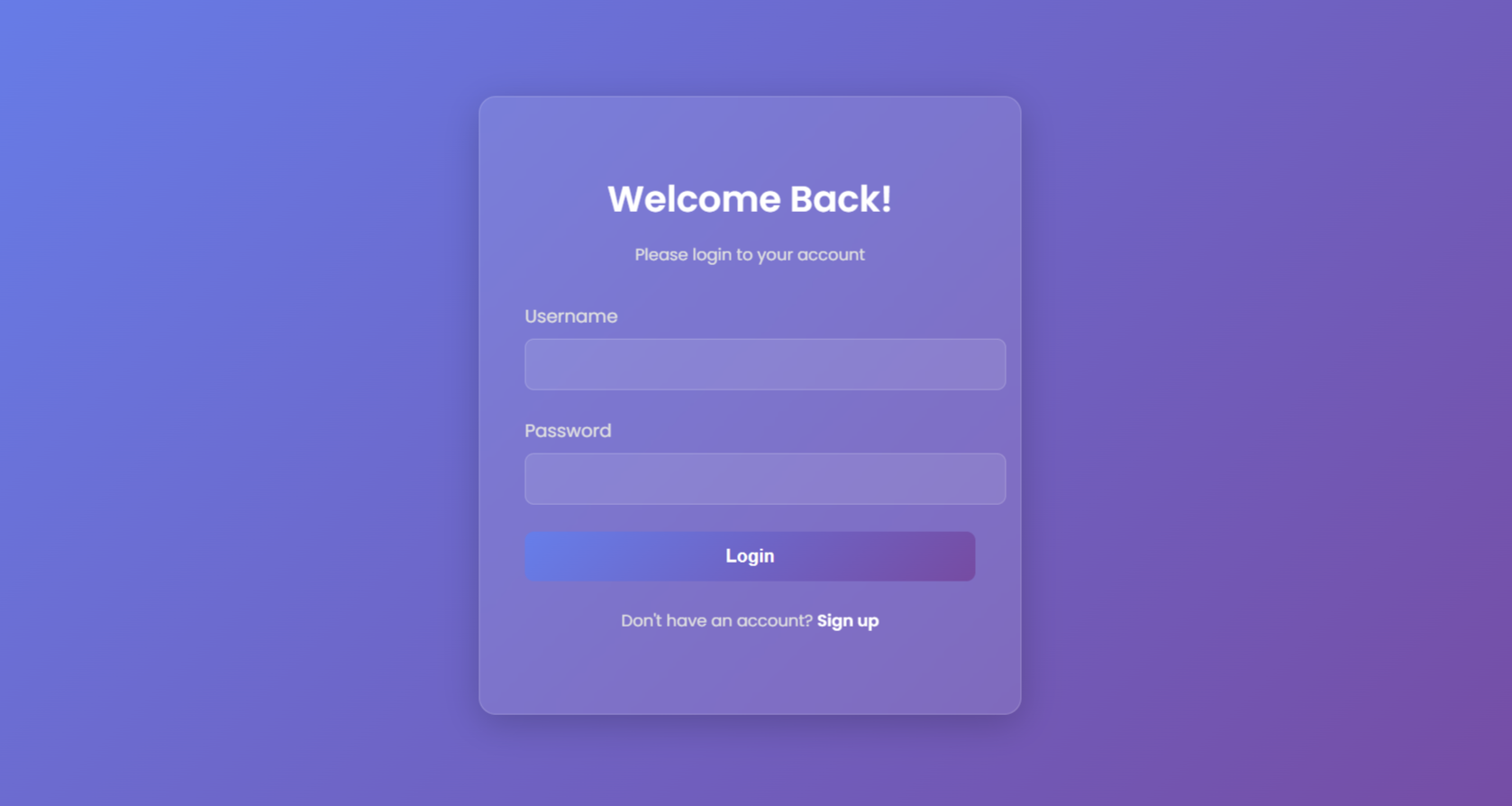
In this blog, we’ll create a modern and stylish login page in html with css code. This project is perfect for beginners and intermediate developers who want to practice their front-end skills while building something visually appealing. The login page features a gradient background, glassmorphism effect, smooth animations, and a responsive design.
Features of the Login Page
- Gradient Background: A visually appealing background using a linear gradient.
- Glassmorphism Effect: A semi-transparent, blurred container for a modern look.
- Animations: Smooth fade-in and slide-in animations for a dynamic user experience.
- Responsive Design: Works seamlessly on all screen sizes, from desktops to mobile devices.
- Interactive Elements: Hover effects, focus states, and a gradient button for enhanced interactivity.
Full Code Implementation
Sure! Let’s dive deeper into the code explanation for the Stylish Login Page project. I’ll break down each section of the HTML and CSS code to help you understand how everything works together.
HTML Code:
<!DOCTYPE html>
<html lang="en">

<head>
  <meta charset="UTF-8">
  <meta name="viewport" content="width=device-width, initial-scale=1.0">
  <title>Stylish Login Page</title>
  <link rel="stylesheet" href="style.css">
  <link href="https://fonts.googleapis.com/css2?family=Poppins:wght@400;600&display=swap" rel="stylesheet">
</head>

<body>
  <div class="login-container">
    <div class="login-box">
      <h2>Welcome Back!</h2>
      <p>Please login to your account</p>
      <form>
        <div class="input-group">
          <label for="username">Username</label>
          <input type="text" id="username" name="username">
        </div>
        <div class="input-group">
          <label for="password">Password</label>
          <input type="password" id="password" name="password">
        </div>
        <button type="submit" class="login-button">Login</button>
      </form>
      <p class="signup-link">Don't have an account? <a href="#">Sign up</a></p>
    </div>
  </div>
</body>

</html>Key Points:
- <!DOCTYPE html>: Declares the document type as HTML5.
- <html lang=”en”>: Specifies the language of the document (English).
- <meta charset=”UTF-8″>: Ensures the browser uses UTF-8 character encoding.
- <meta name=”viewport”>: Makes the page responsive by setting the viewport width to the device width.
- <title>: Sets the title of the page (displayed in the browser tab).
- <link rel=”stylesheet”>: Links the external CSS file (style.css) for styling.
- <link href=”https://fonts.googleapis.com”>: Imports the Poppins font from Google Fonts.
- <div class=”login-container”>: The main container for the login box.
- <div class=”login-box”>: The inner container for the login form and text.
- <form>: Contains the input fields and login button.
- <label>: Associates labels with input fields for better accessibility.
- <input>: Input fields for username and password.
- <button>: The login button to submit the form.
- <p class=”signup-link”>: A link for users who don’t have an account.
Styling CSS:
/* General Styles */
body {
  margin: 0;
  padding: 0;
  font-family: 'Poppins', sans-serif;
  background: linear-gradient(135deg, #667eea, #764ba2);
  display: flex;
  justify-content: center;
  align-items: center;
  height: 100vh;
  color: #fff;
  overflow: hidden;
}

/* Login Container */
.login-container {
  background: rgba(255, 255, 255, 0.1);
  backdrop-filter: blur(10px);
  border-radius: 15px;
  box-shadow: 0 8px 32px rgba(0, 0, 0, 0.2);
  padding: 2.5rem;
  width: 100%;
  max-width: 400px;
  text-align: center;
  border: 1px solid rgba(255, 255, 255, 0.2);
  animation: fadeIn 1s ease-in-out forwards;
}

@keyframes fadeIn {
  from {
    opacity: 0;
    transform: translateY(-20px);
  }

  to {
    opacity: 1;
    transform: translateY(0);
  }
}

/* Login Box */
.login-box h2 {
  margin-bottom: 0.5rem;
  font-size: 2rem;
  font-weight: 600;
  color: #fff;
  animation: slideInLeft 1s ease-in-out 0.2s forwards;
  opacity: 0;
}

.login-box p {
  margin-bottom: 2rem;
  font-size: 0.9rem;
  color: #e0e0e0;
  animation: slideInLeft 1s ease-in-out 0.4s forwards;
  opacity: 0;
}

@keyframes slideInLeft {
  from {
    opacity: 0;
    transform: translateX(-20px);
  }

  to {
    opacity: 1;
    transform: translateX(0);
  }
}

/* Input Groups */
.input-group {
  margin-bottom: 1.5rem;
  text-align: left;
  animation: slideInRight 1s ease-in-out 0.6s forwards;
  opacity: 0;
}

.input-group label {
  display: block;
  margin-bottom: 0.5rem;
  font-size: 1rem;
  color: #e0e0e0;
  font-weight: 500;
}

.input-group input {
  width: 100%;
  padding: 0.8rem;
  background: rgba(255, 255, 255, 0.1);
  border: 1px solid rgba(255, 255, 255, 0.2);
  border-radius: 8px;
  font-size: 1rem;
  color: #fff;
  outline: none;
  transition: all 0.3s ease;
}

.input-group input:focus {
  border-color: #fff;
  background: rgba(255, 255, 255, 0.2);
  transform: scale(1.02);
}

@keyframes slideInRight {
  from {
    opacity: 0;
    transform: translateX(20px);
  }

  to {
    opacity: 1;
    transform: translateX(0);
  }
}

/* Login Button */
.login-button {
  width: 100%;
  padding: 0.8rem;
  background: linear-gradient(135deg, #667eea, #764ba2);
  color: #fff;
  border: none;
  border-radius: 8px;
  font-size: 1rem;
  font-weight: 600;
  cursor: pointer;
  transition: all 0.3s ease;
  animation: slideInUp 1s ease-in-out 0.8s forwards;
  opacity: 0;
}

.login-button:hover {
  background: linear-gradient(135deg, #764ba2, #667eea);
  transform: translateY(-2px);
  box-shadow: 0 4px 15px rgba(0, 0, 0, 0.3);
}

@keyframes slideInUp {
  from {
    opacity: 0;
    transform: translateY(20px);
  }

  to {
    opacity: 1;
    transform: translateY(0);
  }
}

/* Signup Link */
.signup-link {
  margin-top: 1.5rem;
  font-size: 0.9rem;
  color: #e0e0e0;
  animation: fadeIn 1s ease-in-out 1s forwards;
  opacity: 0;
}

.signup-link a {
  color: #fff;
  text-decoration: none;
  font-weight: 600;
  transition: all 0.3s ease;
}

.signup-link a:hover {
  text-decoration: underline;
  color: #667eea;
}Key Points:
1. General Styles
body {
  margin: 0;
  padding: 0;
  font-family: 'Poppins', sans-serif;
  background: linear-gradient(135deg, #667eea, #764ba2);
  display: flex;
  justify-content: center;
  align-items: center;
  height: 100vh;
  color: #fff;
  overflow: hidden;
}- margin: 0; padding: 0;: Removes default margin and padding from the body.
- font-family: ‘Poppins’: Sets the font for the entire page.
- background: linear-gradient: Creates a gradient background using two colors.
- display: flex: Uses Flexbox to center the login container both horizontally and vertically.
- height: 100vh: Ensures the body takes up the full height of the viewport.
- color: #fff: Sets the default text color to white.
- overflow: hidden: Prevents scrolling on the page.
2. Login Container
.login-container {
  background: rgba(255, 255, 255, 0.1);
  backdrop-filter: blur(10px);
  border-radius: 15px;
  box-shadow: 0 8px 32px rgba(0, 0, 0, 0.2);
  padding: 2.5rem;
  width: 100%;
  max-width: 400px;
  text-align: center;
  border: 1px solid rgba(255, 255, 255, 0.2);
  animation: fadeIn 1s ease-in-out forwards;
}- background: rgba(255, 255, 255, 0.1): Adds a semi-transparent white background.
- backdrop-filter: blur(10px): Creates a blur effect for the glassmorphism look.
- border-radius: 15px: Rounds the corners of the container.
- box-shadow: Adds a subtle shadow to make the container stand out.
- padding: 2.5rem: Adds space inside the container.
- max-width: 400px: Limits the width of the container for better readability.
- animation: fadeIn: Applies a fade-in animation to the container.
3. Animations
@keyframes fadeIn {
  from { opacity: 0; transform: translateY(-20px); }
  to { opacity: 1; transform: translateY(0); }
}

@keyframes slideInLeft {
  from { opacity: 0; transform: translateX(-20px); }
  to { opacity: 1; transform: translateX(0); }
}

@keyframes slideInRight {
  from { opacity: 0; transform: translateX(20px); }
  to { opacity: 1; transform: translateX(0); }
}

@keyframes slideInUp {
  from { opacity: 0; transform: translateY(20px); }
  to { opacity: 1; transform: translateY(0); }
}- fadeIn: Fades in the container from the top.
- slideInLeft: Slides in elements from the left.
- slideInRight: Slides in elements from the right.
- slideInUp: Slides in elements from the bottom.
4. Input Fields
.input-group {
  margin-bottom: 1.5rem;
  text-align: left;
  animation: slideInRight 1s ease-in-out 0.6s forwards;
  opacity: 0;
}

.input-group input {
  width: 100%;
  padding: 0.8rem;
  background: rgba(255, 255, 255, 0.1);
  border: 1px solid rgba(255, 255, 255, 0.2);
  border-radius: 8px;
  font-size: 1rem;
  color: #fff;
  outline: none;
  transition: all 0.3s ease;
}

.input-group input:focus {
  border-color: #fff;
  background: rgba(255, 255, 255, 0.2);
  transform: scale(1.02);
}- margin-bottom: 1.5rem: Adds space between input groups.
- animation: slideInRight: Slides in the input fields from the right.
- background: rgba(255, 255, 255, 0.1): Makes the input fields semi-transparent.
- transition: all 0.3s ease: Adds a smooth transition for hover and focus effects.
- transform: scale(1.02): Slightly enlarges the input field on focus.
5. Login Button
.login-button {
  width: 100%;
  padding: 0.8rem;
  background: linear-gradient(135deg, #667eea, #764ba2);
  color: #fff;
  border: none;
  border-radius: 8px;
  font-size: 1rem;
  font-weight: 600;
  cursor: pointer;
  transition: all 0.3s ease;
  animation: slideInUp 1s ease-in-out 0.8s forwards;
  opacity: 0;
}

.login-button:hover {
  background: linear-gradient(135deg, #764ba2, #667eea);
  transform: translateY(-2px);
  box-shadow: 0 4px 15px rgba(0, 0, 0, 0.3);
}- background: linear-gradient: Adds a gradient background to the button.
- transform: translateY(-2px): Moves the button up slightly on hover.
- box-shadow: Adds a shadow to make the button stand out.
6. Signup Link
.signup-link {
  margin-top: 1.5rem;
  font-size: 0.9rem;
  color: #e0e0e0;
  animation: fadeIn 1s ease-in-out 1s forwards;
  opacity: 0;
}

.signup-link a {
  color: #fff;
  text-decoration: none;
  font-weight: 600;
  transition: all 0.3s ease;
}

.signup-link a:hover {
  text-decoration: underline;
  color: #667eea;
}- animation: fadeIn: Fades in the signup link after other elements.
- text-decoration: underline: Underlines the link on hover.
Conclusion
This project demonstrates how to create a modern and stylish login page using HTML and CSS. By combining gradients, animations, and glassmorphism, we’ve built a page that is both visually appealing and functional. Feel free to customize the design and add more features to suit your needs!