Creating well-structured, responsive, and visually appealing web layouts is a cornerstone of web development. This guide covers everything you need to know about HTML Layout Elements and techniques, including semantic HTML, CSS layout models, responsive design, and modern trends.
1. HTML Layout Elements
HTML provides a range of semantic elements to structure web content. These elements improve accessibility, SEO, and code readability.
a. Common Semantic Elements
<header>
- Represents the top section of a page or section.
- Typically includes headings, logos, or navigation menus.
<nav>
- Defines a section for navigation links.
- Often placed inside the
<header>or as a standalone section.
<main>
- Represents the main content of the document.
- Should be unique and not repeated across pages.
<section>
- Groups related content thematically.
- Example: A chapter, tabbed content, or a group of related articles.
<article>
- Represents self-contained content that can be distributed independently.
- Example: Blog posts, news articles, or forum posts.
<aside>
- Contains content tangentially related to the main content.
- Often used for sidebars, pull quotes, or advertisements.
<footer>
- Represents the footer of a document or section.
- Typically includes copyright information, contact details, or related links.
<div>
- A generic container for grouping content.
- Used for styling or layout purposes when no semantic element is appropriate.
<span>
- An inline container for styling or grouping text.
2. CSS Layout Techniques
CSS provides powerful tools to create flexible and responsive layouts. Below are the most commonly used techniques:
a. CSS Flexbox
- A one-dimensional layout model for arranging items in rows or columns.
- Ideal for creating flexible and dynamic layouts.
Example:
  .container {
    display: flex;
    justify-content: space-between; /* Aligns items horizontally */
    align-items: center; /* Aligns items vertically */
}b. CSS Grid
- A two-dimensional layout system for creating complex grid-based designs.
Example:
  .container {
    display: grid;
    grid-template-columns: 1fr 2fr 1fr; /* Three columns */
    gap: 10px; /* Space between grid items */
}c. Floats
- Older technique for wrapping text around images or creating multi-column layouts.
Example:
  .float-left {
    float: left;
    margin-right: 10px;
}d. Positioning
- Use CSS positioning (
relative,absolute,fixed,sticky) to control element placement.
Example:
  .box {
    position: absolute;
    top: 10px;
    left: 20px;
}e. Media Queries
- Used for creating responsive designs that adapt to different screen sizes.
Example:
  @media (max-width: 768px) {
    .container {
      flex-direction: column; /* Stack items vertically on small screens */
    }
}3. Responsive Design Principles
Responsive design ensures your website looks great on all devices. Key principles include:
- Fluid Layouts: Use percentages or
frunits instead of fixed widths. - Flexible Images: Set
max-width: 100%to ensure images scale with the container. - Breakpoints: Use media queries to adjust layouts at specific screen sizes.
4. CSS Frameworks for Layouts
CSS frameworks like Bootstrap, Tailwind CSS, and Foundation provide pre-built components and grid systems to simplify layout creation.
Example: Bootstrap Grid System:
<div class="container">
  <div class="row">
    <div class="col-md-8">Main Content</div>
    <div class="col-md-4">Sidebar</div>
  </div>
</div>5. Modern Layout Trends
- CSS Subgrid: A newer feature of CSS Grid that allows nested grids to align with their parent grid.
- Intrinsic Design: Combines fixed, fluid, and adaptive layouts for more dynamic designs.
- Dark Mode: Use CSS variables and media queries to create dark mode layouts.
6. Tools for Layout Design
- Browser Developer Tools: Inspect and debug layouts in real-time.
- CSS Preprocessors: Use tools like SASS or LESS to write more maintainable CSS.
- Design Tools: Tools like Figma or Adobe XD help visualize layouts before coding.
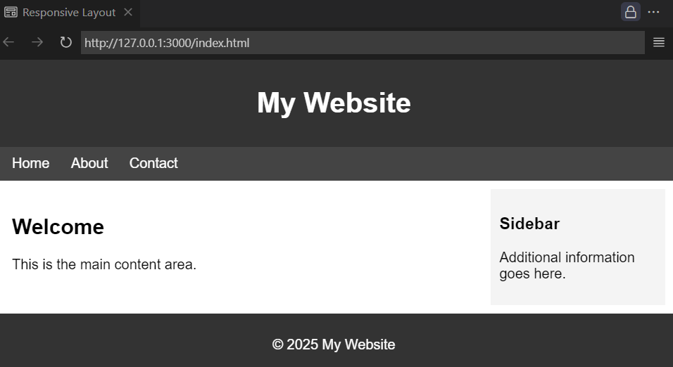
7. Example Layout
Here’s a complete example of a responsive layout using HTML and CSS:
<!DOCTYPE html>
<html lang="en">
<head>
  <meta charset="UTF-8">
  <meta name="viewport" content="width=device-width, initial-scale=1.0">
  <title>Responsive Layout</title>
  <style>
    body {
      font-family: Arial, sans-serif;
      margin: 0;
      padding: 0;
    }
    header, footer {
      background-color: #333;
      color: white;
      padding: 10px;
      text-align: center;
    }
    nav {
      background-color: #444;
      padding: 10px;
    }
    nav a {
      color: white;
      margin: 0 10px;
      text-decoration: none;
    }
    .container {
      display: flex;
      margin: 10px;
    }
    main {
      flex: 3;
      padding: 10px;
    }
    aside {
      flex: 1;
      background-color: #f4f4f4;
      padding: 10px;
    }
    @media (max-width: 768px) {
      .container {
        flex-direction: column;
      }
    }
  </style>
</head>
<body>
  <header>
    <h1>My Website</h1>
  </header>
  <nav>
    <a href="#">Home</a>
    <a href="#">About</a>
    <a href="#">Contact</a>
  </nav>
  <div class="container">
    <main>
      <h2>Welcome</h2>
      <p>This is the main content area.</p>
    </main>
    <aside>
      <h3>Sidebar</h3>
      <p>Additional information goes here.</p>
    </aside>
  </div>
  <footer>
    <p>© 2025 My Website</p>
  </footer>
</body>
</html>output:
8. Conclusion
Mastering HTML layout elements and CSS techniques is essential for creating modern, responsive, and user-friendly websites. By using semantic HTML, Flexbox, Grid, and responsive design principles, you can build layouts that adapt seamlessly to different devices and screen sizes. Additionally, leveraging CSS frameworks and design tools can streamline your workflow and improve productivity.
As web technologies continue to evolve, staying updated with trends like CSS Subgrid and intrinsic design will help you create cutting-edge layouts. Always prioritize accessibility, maintainability, and performance to deliver exceptional web experiences.