Icons are essential for enhancing user interfaces and improving usability. They can be created and implemented in various ways using CSS, SVG, or external icon libraries. This guide covers everything you need to know about CSS Icons.
1. Types of CSS Icons
There are multiple ways to use icons in web development:
- Icon Libraries (Font-based icons)
- SVG Icons (Scalable Vector Graphics)
- CSS-Only Icons (Using pure CSS and HTML)
- Image-Based Icons (PNG, JPG, SVG files)
Let’s go through each method in detail.
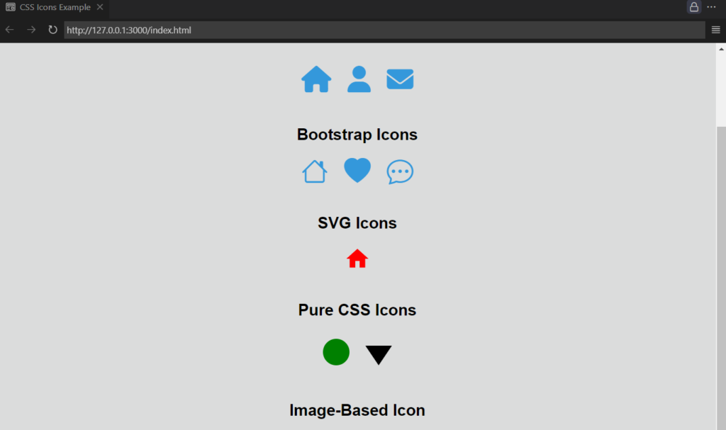
example:
<!DOCTYPE html>
<html lang="en">
<head>
    <meta charset="UTF-8">
    <meta name="viewport" content="width=device-width, initial-scale=1.0">
    <title>CSS Icons Example</title>

    <!-- Font Awesome Icons -->
    <link rel="stylesheet" href="https://cdnjs.cloudflare.com/ajax/libs/font-awesome/6.5.1/css/all.min.css">

    <!-- Bootstrap Icons -->
    <link rel="stylesheet" href="https://cdn.jsdelivr.net/npm/bootstrap-icons/font/bootstrap-icons.css">

    <style>
        /* General Styling */
        body {
            font-family: Arial, sans-serif;
            text-align: center;
            margin: 40px;
        }

        h2 {
            margin-top: 40px;
        }

        /* Styling for Font Awesome & Bootstrap Icons */
        .icon {
            font-size: 40px;
            color: #3498db;
            margin: 10px;
        }

        /* Styling for Inline SVG */
        .svg-icon {
            width: 40px;
            height: 40px;
            fill: red;
        }

        /* CSS-Only Circle Icon */
        .circle-icon {
            width: 40px;
            height: 40px;
            background-color: green;
            border-radius: 50%;
            display: inline-block;
            margin: 10px;
        }

        /* CSS-Only Arrow Icon */
        .arrow {
            width: 0;
            height: 0;
            border-left: 20px solid transparent;
            border-right: 20px solid transparent;
            border-top: 30px solid black;
            display: inline-block;
            margin: 10px;
        }

        /* Image-Based Icon */
        .image-icon {
            width: 40px;
            height: 40px;
            background: url('https://via.placeholder.com/40') no-repeat center center;
            background-size: cover;
            display: inline-block;
            margin: 10px;
        }
    </style>
</head>
<body>

    <h1>CSS Icons Example</h1>

    <!-- Font Awesome Icons -->
    <h2>Font Awesome Icons</h2>
    <i class="fa-solid fa-home icon"></i>
    <i class="fa-solid fa-user icon"></i>
    <i class="fa-solid fa-envelope icon"></i>

    <!-- Bootstrap Icons -->
    <h2>Bootstrap Icons</h2>
    <i class="bi bi-house icon"></i>
    <i class="bi bi-heart-fill icon"></i>
    <i class="bi bi-chat-dots icon"></i>

    <!-- Inline SVG Icons -->
    <h2>SVG Icons</h2>
    <svg class="svg-icon" xmlns="http://www.w3.org/2000/svg" viewBox="0 0 24 24">
        <path d="M10 20v-6h4v6h5v-8h3L12 3 2 12h3v8h5z"/>
    </svg>

    <!-- CSS-Only Icons -->
    <h2>Pure CSS Icons</h2>
    <div class="circle-icon"></div> <!-- Circle Icon -->
    <div class="arrow"></div> <!-- Arrow Icon -->

    <!-- Image-Based Icon -->
    <h2>Image-Based Icon</h2>
    <div class="image-icon"></div> <!-- Placeholder image -->

</body>
</html>
output:
2. Using Icon Libraries (Font-Based Icons)
Icon libraries provide a large collection of pre-designed icons that can be used directly by adding a simple <i> or <span> tag. These libraries use fonts instead of images, making icons scalable without losing quality.
Popular Icon Libraries:
a. Font Awesome
Font Awesome is one of the most popular icon libraries with thousands of icons.
How to Use Font Awesome
1. Add the Font Awesome CDN link in your HTML file:
<link rel="stylesheet" href="https://cdnjs.cloudflare.com/ajax/libs/font-awesome/6.5.1/css/all.min.css">2. Use icons by adding <i> tags with appropriate classes:
   <i class="fa-solid fa-home"></i> Home
   <i class="fa-solid fa-user"></i> User
<i class="fa-solid fa-envelope"></i> Mail3. Styling with CSS:
   i {
     font-size: 24px;
     color: #3498db;
     margin-right: 8px;
}b. Bootstrap Icons
Bootstrap Icons are another lightweight option for adding scalable vector icons.
How to Use Bootstrap Icons
1. Include Bootstrap Icons in your HTML:
<link rel="stylesheet" href="https://cdn.jsdelivr.net/npm/bootstrap-icons/font/bootstrap-icons.css">2. Use icons in your HTML:
   <i class="bi bi-house"></i>
   <i class="bi bi-heart-fill"></i>
<i class="bi bi-chat-dots"></i>3. CSS Styling Example
   .bi {
     font-size: 20px;
     color: red;
}3. Using SVG Icons
SVG (Scalable Vector Graphics) is another great way to use icons because they remain crisp and clear at any size.
a. Inline SVG
An inline SVG allows you to customize the icon directly in HTML.
<svg width="50" height="50" viewBox="0 0 24 24" fill="none" xmlns="http://www.w3.org/2000/svg">
  <path d="M10 20v-6h4v6h5v-8h3L12 3 2 12h3v8h5z" fill="black"/>
</svg>b. External SVG File
If you have an external .svg file, use the <img> tag:
<img src="icon.svg" alt="SVG Icon" width="50">c. SVG as a Background
.icon {
  width: 40px;
  height: 40px;
  background: url('icon.svg') no-repeat center center;
  background-size: cover;
}4. Creating Pure CSS Icons
If you don’t want to rely on external libraries or images, you can create icons using pure CSS.
a. Simple Circle Icon
<div class="circle-icon"></div>.circle-icon {
width: 30px;
height: 30px;
background-color: blue;
border-radius: 50%;
}b. CSS Arrow Icon
<div class="arrow"></div>.arrow {
width: 0;
height: 0;
border-left: 10px solid transparent;
border-right: 10px solid transparent;
border-top: 15px solid black;
}c. CSS Star Icon
<div class="star"></div>.star {
display: inline-block;
width: 0;
height: 0;
border-right: 10px solid transparent;
border-bottom: 7px solid yellow;
border-left: 10px solid transparent;
transform: rotate(35deg);
}5. Using Image-Based Icons
If you prefer to use image files (PNG, JPG, SVG), you can do so easily.
a. Using <img> Tag
<img src="icon.png" alt="Icon" width="50">b. Using CSS background-image
.icon {
  width: 50px;
  height: 50px;
  background: url('icon.png') no-repeat center center;
  background-size: contain;
}6. When to Use Each Method?
| Method | Pros | Cons |
|---|---|---|
| Icon Libraries (Font-based icons) | Easy to use, scalable, customizable with CSS | External dependency, limited to available icons |
| SVG Icons | Scalable, customizable, lightweight | Slightly more complex to edit |
| Pure CSS Icons | No external files needed, highly customizable | Limited complexity, requires CSS knowledge |
| Image-Based Icons (PNG/JPG/SVG) | Easy to use, widely supported | Not scalable (PNG/JPG), requires extra HTTP requests |
Conclusion
CSS icons enhance user experience and improve design aesthetics. Choosing the right method depends on your needs:
- Font-based icons (e.g., Font Awesome, Bootstrap Icons) are great for general use.
- SVGs are ideal for scalability and customization.
- Pure CSS icons are best when you need simple, lightweight shapes.
- Image-based icons work well for logos or highly detailed icons.