What is the CSS Display Property
The display property in CSS determines how an element is rendered on a webpage. It controls:
- Whether an element takes full width or only as much space as needed.
- Whether an element starts on a new line or stays inline.
- Whether an element is hidden or visible.
- How an element behaves in flexbox, grid, or table layouts.
Understanding the CSS Display Property is crucial for designing structured and responsive web pages. Below, we will go through all major display values with detailed explanations and full code examples.
1. display: block – The Default for Block Elements
What Does It Do?
- Makes an element take up the full width of its container.
- Forces a new line before and after the element.
- Allows setting width, height, margin, and padding.
Common Block Elements:
<div>, <p>, <h1> to <h6>, <ul>, <li>, <form>
Example: Block Elements
<!DOCTYPE html>
<html lang="en">
<head>
    <meta charset="UTF-8">
    <meta name="viewport" content="width=device-width, initial-scale=1.0">
    <title>Display Block Example</title>
    <style>
        .block-example {
            display: block;
            width: 300px;
            background-color: lightblue;
            padding: 10px;
            margin-bottom: 10px;
        }
    </style>
</head>
<body>
    <div class="block-example">I am a block element</div>
    <p class="block-example">I am also a block element</p>
</body>
</html>output:
I am also a block element
Explanation
- <div> and <p> are block elements, so they start on a new line.
- Each block element takes full width unless a specific width is set.
2. display: inline – The Default for Inline Elements
What Does It Do?
- Makes an element take up only as much space as needed.
- Keeps elements on the same line.
- Cannot set width or height manually.
Common Inline Elements:
<span>, <a>, <strong>, <em>, <img>
Example: Inline Elements
<!DOCTYPE html>
<html lang="en">
<head>
    <meta charset="UTF-8">
    <meta name="viewport" content="width=device-width, initial-scale=1.0">
    <title>Display Inline Example</title>
    <style>
        .inline-example {
            display: inline;
            background-color: yellow;
            padding: 5px;
        }
    </style>
</head>
<body>
    <span class="inline-example">I am inline</span>
    <span class="inline-example">Me too!</span>
</body>
</html>output:
Explanation
- The two <span> elements stay on the same line.
- Unlike block elements, they do not take full width.
3. display: inline-block – Best of Both Worlds
What Does It Do?
- Behaves like inline, but allows setting width and height.
- Stays on the same line with other inline elements.
Example: Inline-Block Elements
<!DOCTYPE html>
<html lang="en">
<head>
    <meta charset="UTF-8">
    <meta name="viewport" content="width=device-width, initial-scale=1.0">
    <title>Display Inline-Block Example</title>
    <style>
        .inline-block-example {
            display: inline-block;
            width: 150px;
            height: 50px;
            background-color: lightgreen;
            text-align: center;
            line-height: 50px;
            margin: 5px;
        }
    </style>
</head>
<body>
    <div class="inline-block-example">Box 1</div>
    <div class="inline-block-example">Box 2</div>
</body>
</html>output:
Explanation
- Unlike inline, inline-block allows width and height to be set.
- Elements stay on the same line, like inline elements.
4. display: none – Hide Elements Completely
What Does It Do?
- Hides the element completely.
- The element does not take up space in the layout.
Example: Hiding an Element
<!DOCTYPE html>
<html lang="en">
<head>
    <meta charset="UTF-8">
    <meta name="viewport" content="width=device-width, initial-scale=1.0">
    <title>Display None Example</title>
    <style>
        .hidden {
            display: none;
        }
    </style>
</head>
<body>
    <p class="hidden">You can't see me!</p>
    <p>This paragraph is visible.</p>
</body>
</html>Explanation
- The first paragraph disappears.
- The second paragraph remains visible.
5. display: flex – Make Layouts Easy
What Does It Do?
- Makes an element a flex container.
- Aligns and distributes elements easily.
Example: Flexbox Layout
<!DOCTYPE html>
<html lang="en">
<head>
    <meta charset="UTF-8">
    <meta name="viewport" content="width=device-width, initial-scale=1.0">
    <title>Display Flex Example</title>
    <style>
        .flex-container {
            display: flex;
            justify-content: space-around;
            align-items: center;
            background-color: lightgray;
            padding: 20px;
        }
        .flex-item {
            background-color: steelblue;
            color: white;
            padding: 20px;
            width: 100px;
            text-align: center;
        }
    </style>
</head>
<body>
    <div class="flex-container">
        <div class="flex-item">Item 1</div>
        <div class="flex-item">Item 2</div>
        <div class="flex-item">Item 3</div>
    </div>
</body>
</html>output:
Explanation
- The items are arranged in a row.
- They are evenly spaced.
6. display: grid – CSS Grid Layout
What Does It Do?
- Creates a grid-based layout.
- Allows precise placement of elements.
Example: CSS Grid Layout
<!DOCTYPE html>
<html lang="en">
<head>
    <meta charset="UTF-8">
    <meta name="viewport" content="width=device-width, initial-scale=1.0">
    <title>Display Grid Example</title>
    <style>
        .grid-container {
            display: grid;
            grid-template-columns: repeat(3, 1fr);
            gap: 10px;
            background-color: lightgray;
            padding: 20px;
        }
        .grid-item {
            background-color: tomato;
            color: white;
            padding: 20px;
            text-align: center;
        }
    </style>
</head>
<body>
    <div class="grid-container">
        <div class="grid-item">1</div>
        <div class="grid-item">2</div>
        <div class="grid-item">3</div>
    </div>
</body>
</html>output:
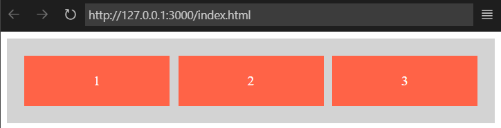
Explanation
- Items are arranged in a three-column grid.
Final Thoughts
Understanding the display property is essential for modern web development. By mastering block, inline, flex, and grid layouts, you can create well-structured and responsive designs. Let me know if you need additional explanations or more advanced examples.