Lists are an essential part of web design, used to display structured content in an organized manner. In HTML, there are three main types of lists:
- Unordered Lists (
<ul>) – Items appear with bullet points. - Ordered Lists (
<ol>) – Items appear with numbers or letters. - Definition Lists (
<dl>) – Used for terms and their descriptions.
CSS Lists provides powerful styling options for lists, allowing customization of bullet points, numbering, spacing, colors, and even replacing markers with images or icons. With CSS, you can transform a basic list into an attractive and well-structured element for menus, navigation bars, and content sections.
1. Basic Unordered CSS Lists (<ul>)
HTML:
<ul>
  <li>Apple</li>
  <li>Banana</li>
  <li>Cherry</li>
</ul>Explanation:
- <ul>: Creates an unordered list.
- <li>: Defines each list item.
- By default, browsers display an unordered list with round bullet points (
•).
CSS Customization Example:
ul {
  list-style-type: square;
  padding: 10px;
}Explanation:
- list-style-type: square; → Changes bullet points from default (
•) to squares (■). - padding: 10px; → Adds space around the list for better readability.
2. Basic Ordered CSS Lists (<ol>)
HTML:
<ol>
  <li>Step 1</li>
  <li>Step 2</li>
  <li>Step 3</li>
</ol>Explanation:
- <ol>: Creates an ordered list.
- <li>: Each item is displayed with numbers (1, 2, 3… by default).
CSS Customization Example:
ol {
  list-style-type: upper-roman;
  padding: 10px;
}Explanation:
- list-style-type: upper-roman; → Changes numbers to Roman numerals (I, II, III).
- padding: 10px; → Adds space around the list.
3. Removing Default List Styles
CSS:
ul, ol {
  list-style: none;
  padding: 0;
  margin: 0;
}Explanation:
- list-style: none; → Removes bullets and numbers from lists.
- padding: 0; → Removes extra space around the list.
- margin: 0; → Removes default margin.
This is useful when creating custom-designed lists, like navigation menus.
4. Custom List Marker Using an Image
CSS:
ul {
  list-style-image: url('custom-bullet.png');
}Explanation:
- list-style-image: url(‘custom-bullet.png’); → Replaces default bullets with a custom image.
If the image is not found, the browser falls back to the default bullet.
5. Using ::marker to Style List Markers
CSS:
li::marker {
  color: red;
  font-size: 1.5em;
  content: "✔ ";
}Explanation:
- li::marker → Targets the bullet/number of list items.
- color: red; → Changes the color of bullets/numbers to red.
- font-size: 1.5em; → Increases the size of the bullet.
- content: “✔ “; → Replaces the bullet with a checkmark.
6. Nested Lists
HTML:
<ul>
  <li>Fruits
    <ul>
      <li>Apple</li>
      <li>Banana</li>
    </ul>
  </li>
</ul>Explanation:
- A
<ul>inside another<ul>creates a nested list. - “Fruits” is a parent list item.
- “Apple” and “Banana” are sub-items.
CSS for Nested Lists:
ul ul {
  list-style-type: circle;
  margin-left: 20px;
}Explanation:
- ul ul → Targets nested lists.
- list-style-type: circle; → Changes bullets to circles (
○). - margin-left: 20px; → Indents the sublist.
7. Inline List for Navigation Menus
HTML:
<ul class="menu">
  <li><a href="#">Home</a></li>
  <li><a href="#">About</a></li>
  <li><a href="#">Contact</a></li>
</ul>CSS:
.menu {
  list-style: none;
  padding: 0;
  display: flex;
  gap: 15px;
}

.menu li {
  display: inline;
}

.menu a {
  text-decoration: none;
  color: black;
  font-weight: bold;
}

.menu a:hover {
  color: red;
}Explanation:
- .menu → Styles the navigation list.
- list-style: none; → Removes default bullets.
- display: flex; → Makes list items appear in a row.
- gap: 15px; → Adds spacing between items.
- menu a:hover { color: red; } → Changes link color on hover.
8. Full Example with HTML & CSS
Code:
<!DOCTYPE html>
<html lang="en">
<head>
    <meta charset="UTF-8">
    <meta name="viewport" content="width=device-width, initial-scale=1.0">
    <title>Styled Lists</title>
    <style>
        body {
            font-family: Arial, sans-serif;
        }

        /* Unordered List Styling */
        ul {
            list-style-type: square;
            padding: 10px;
        }

        /* Ordered List Styling */
        ol {
            list-style-type: upper-roman;
            padding: 10px;
        }

        /* Remove List Style */
        .no-style {
            list-style: none;
            padding: 0;
            margin: 0;
        }

        /* Custom Marker */
        li::marker {
            color: blue;
            font-size: 1.2em;
            content: "★ ";
        }

        /* Nested List */
        ul ul {
            list-style-type: circle;
            margin-left: 20px;
        }

        /* Inline List for Menu */
        .menu {
            list-style: none;
            padding: 0;
            display: flex;
            gap: 15px;
        }

        .menu li {
            display: inline;
        }

        .menu a {
            text-decoration: none;
            color: black;
            font-weight: bold;
        }

        .menu a:hover {
            color: red;
        }
    </style>
</head>
<body>

    <h2>Unordered List</h2>
    <ul>
        <li>Item One</li>
        <li>Item Two</li>
        <li>Item Three</li>
    </ul>

    <h2>Ordered List</h2>
    <ol>
        <li>Step One</li>
        <li>Step Two</li>
        <li>Step Three</li>
    </ol>

    <h2>Nested List</h2>
    <ul>
        <li>Fruits
            <ul>
                <li>Apple</li>
                <li>Banana</li>
            </ul>
        </li>
    </ul>

    <h2>Navigation Menu</h2>
    <ul class="menu">
        <li><a href="#">Home</a></li>
        <li><a href="#">About</a></li>
        <li><a href="#">Contact</a></li>
    </ul>

</body>
</html>output:
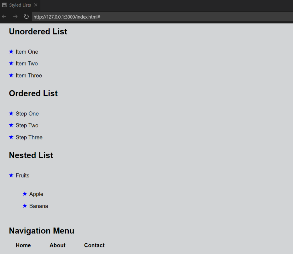
Explanation of Full Code:
- The unordered list has a square bullet.
- The ordered list uses Roman numerals.
- Nested lists have different bullet styles.
- Custom markers (
★) replace bullets. - A horizontal navigation menu is created using display: flex;.