A CSS Links is a connection from one web page to another web page. CSS property can be used to style the links in various different ways.
States of Link: Before discussing CSS properties, it is important to know the states of a link. Links can exist in different states and they can be styled using pseudo-classes.
There are four states of links given below:
- a:link => This is a normal, unvisited link.
- a:visited => This is a link visited by user at least once
- a:hover => This is a link when mouse hovers over it
- a:active => This is a link that is just clicked.
1. Basic CSS Links Styling
- Change the default blue link color.
- Remove the underline.
- Change color when hovered.
HTML (basic-link.html)
<!DOCTYPE html>
<html lang="en">
<head>
    <meta charset="UTF-8">
    <meta name="viewport" content="width=device-width, initial-scale=1.0">
    <title>Basic Link Styling</title>
    <link rel="stylesheet" href="style.css">
</head>
<body>

    <h2>Basic Link Styling</h2>
    <a href="#">This is a normal link</a>

</body>
</html>CSS (style.css)
a {
    color: blue; /* Default color of link */
    text-decoration: none; /* Removes underline */
    font-size: 18px; /* Increases text size */
}

a:hover {
    color: red; /* Changes color on hover */
    text-decoration: underline; /* Adds underline on hover */
}Explanation:
- color: blue; → The link will appear blue by default.
- text-decoration: none; → Removes the default underline from the link.
- font-size: 18px; → Makes the text larger for better visibility.
- :hover → When the user moves the mouse over the link, it changes:
- color: red; → Text becomes red.
- text-decoration: underline; → Underline reappears.
2. Changing Background Color on Hover
- Add a background color to the link.
- Make the link look like a button.
- Change background & text color when hovered.
HTML (background-link.html)
<!DOCTYPE html>
<html lang="en">
<head>
    <meta charset="UTF-8">
    <meta name="viewport" content="width=device-width, initial-scale=1.0">
    <title>Background Color on Hover</title>
    <link rel="stylesheet" href="style.css">
</head>
<body>

    <h2>Background Color on Hover</h2>
    <a href="#" class="background-link">Hover Me</a>

</body>
</html>CSS (style.css)
.background-link {
    background-color: lightgray;
    padding: 8px 12px;
    border-radius: 5px;
    text-decoration: none;
    display: inline-block;
}

.background-link:hover {
    background-color: darkgray;
    color: white;
}Explanation:
- background-color: lightgray; → Gives the link a light gray background.
- padding: 8px 12px; → Adds space inside the link, making it look like a button.
- border-radius: 5px; → Rounds the corners slightly.
- display: inline-block; → Ensures proper spacing & padding.
- :hover → When hovered:
- background-color: darkgray; → Background becomes darker.
- color: white; → Text turns white.
3. Link Buttons
- Make a fully clickable button that looks stylish.
- Add padding, background, rounded corners.
- Create a hover effect.
HTML (button-link.html)
<!DOCTYPE html>
<html lang="en">
<head>
    <meta charset="UTF-8">
    <meta name="viewport" content="width=device-width, initial-scale=1.0">
    <title>Link Button</title>
    <link rel="stylesheet" href="style.css">
</head>
<body>

    <h2>Link Button</h2>
    <a href="#" class="link-button">Click Me</a>

</body>
</html>CSS (style.css)
.link-button {
    display: inline-block;
    padding: 10px 20px;
    background-color: #007BFF;
    color: white;
    text-decoration: none;
    border-radius: 5px;
    font-weight: bold;
    transition: background 0.3s ease-in-out;
}

.link-button:hover {
    background-color: #0056b3;
}Explanation:
- display: inline-block; → Ensures button-like behavior.
- padding: 10px 20px; → Adds space inside for better appearance.
- background-color: #007BFF; → Sets a blue background.
- color: white; → Makes text white.
- border-radius: 5px; → Rounded corners.
- font-weight: bold; → Text appears bold.
- transition: background 0.3s ease-in-out; → Smooth background transition.
- :hover → When hovered, background darkens (#0056b3).
4. Styling Different Link States
- Different colors for normal, visited, hover, and active states.
HTML (link-states.html)
<!DOCTYPE html>
<html lang="en">
<head>
    <meta charset="UTF-8">
    <meta name="viewport" content="width=device-width, initial-scale=1.0">
    <title>Different Link States</title>
    <link rel="stylesheet" href="style.css">
</head>
<body>

    <h2>Styling Different Link States</h2>
    <a href="#" class="state-links">Visit Me</a>

</body>
</html>CSS (style.css)
.state-links:link { color: blue; }     /* Normal (unvisited) */
.state-links:visited { color: purple; } /* Visited link */
.state-links:hover { color: red; }      /* Hover */
.state-links:active { color: green; } /* Active (clicked) */5. Animated Underline Effect
- Show a hidden underline that animates on hover.
HTML (underline-effect.html)
<!DOCTYPE html>
<html lang="en">
<head>
    <meta charset="UTF-8">
    <meta name="viewport" content="width=device-width, initial-scale=1.0">
    <title>Animated Underline</title>
    <link rel="stylesheet" href="style.css">
</head>
<body>

    <h2>Animated Underline Effect</h2>
    <a href="#" class="underline-effect">Hover for Underline</a>

</body>
</html>CSS (style.css)
.underline-effect {
    position: relative;
    text-decoration: none;
    color: #333;
    font-size: 18px;
}

.underline-effect::after {
    content: '';
    position: absolute;
    left: 0;
    bottom: -2px;
    width: 100%;
    height: 2px;
    background-color: #007BFF;
    transform: scaleX(0);
    transition: transform 0.3s ease-in-out;
}

.underline-effect:hover::after {
    transform: scaleX(1);
}Explanation:
- Uses ::after to create a hidden underline.
- Expands the underline on hover with scaleX(1).
- Smooth animation using transition: transform 0.3s ease-in-out;.
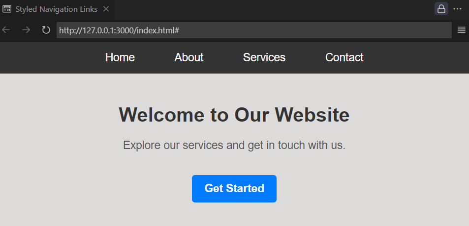
6. Practical Example: Stylish Navigation Menu with Links
This example creates a navigation menu with beautifully styled links, including hover effects, animated underline effects, and button-like links.
HTML (index.html)
<!DOCTYPE html>
<html lang="en">
<head>
    <meta charset="UTF-8">
    <meta name="viewport" content="width=device-width, initial-scale=1.0">
    <title>Styled Navigation Links</title>
    <link rel="stylesheet" href="style.css">
</head>
<body>

    <header>
        <nav>
            <ul>
                <li><a href="#" class="nav-link">Home</a></li>
                <li><a href="#" class="nav-link">About</a></li>
                <li><a href="#" class="nav-link">Services</a></li>
                <li><a href="#" class="nav-link">Contact</a></li>
            </ul>
        </nav>
    </header>

    <div class="content">
        <h1>Welcome to Our Website</h1>
        <p>Explore our services and get in touch with us.</p>
        <a href="#" class="button-link">Get Started</a>
    </div>

</body>
</html>
CSS (style.css)
/* Reset default margin & padding */
body {
    margin: 0;
    font-family: Arial, sans-serif;
    background-color: #f4f4f4;
}

/* Navigation Bar */
nav {
    background-color: #333;
    padding: 15px 0;
    text-align: center;
}

nav ul {
    list-style: none;
    margin: 0;
    padding: 0;
}

nav ul li {
    display: inline;
    margin: 0 20px;
}

/* Navigation Links */
.nav-link {
    text-decoration: none;
    color: white;
    font-size: 18px;
    padding: 10px;
    position: relative;
}

.nav-link::after {
    content: '';
    position: absolute;
    left: 0;
    bottom: -5px;
    width: 100%;
    height: 2px;
    background-color: white;
    transform: scaleX(0);
    transition: transform 0.3s ease-in-out;
}

.nav-link:hover::after {
    transform: scaleX(1);
}

/* Hero Section */
.content {
    text-align: center;
    margin-top: 50px;
}

h1 {
    color: #333;
}

p {
    font-size: 18px;
    color: #555;
}

/* Button Link */
.button-link {
    display: inline-block;
    background-color: #007BFF;
    color: white;
    padding: 12px 20px;
    border-radius: 5px;
    text-decoration: none;
    font-size: 18px;
    font-weight: bold;
    margin-top: 20px;
    transition: background-color 0.3s ease-in-out;
}

.button-link:hover {
    background-color: #0056b3;
}
output:
How to Use This Code
- Create two files:
index.htmlstyle.css
- Copy and paste the respective codes into the files.
- Open
index.htmlin a web browser to see the design in action!
Conclusion
Styling CSS Links with CSS is an essential part of web design, enhancing both the visual appeal and user experience. By using different CSS properties, we can modify links to match the overall design of a website. Basic styling, such as changing colors and removing underlines, helps create a clean look. Adding background colors and padding can transform links into button-like elements, improving usability. Additionally, modifying different link states (normal, visited, hover, and active) ensures a more interactive experience for users. Advanced techniques, like animated underlines, further enhance engagement by providing subtle visual cues. Understanding and implementing these styles allow developers to create well-structured, visually appealing, and user-friendly websites.