CSS Float is a property that allows elements to be positioned to the left or right of their container, enabling other content (like text) to wrap around them. While float was originally designed for simple tasks like wrapping text around images, it has been widely used for creating layouts. However, with the advent of modern CSS tools like Flexbox and Grid, float is now primarily used for its original purpose.
1. What is CSS Float
The float property in CSS is used to position an element to the left or right of its container, allowing other content to flow around it. It takes the following values:
- left: Floats the element to the left.
- right: Floats the element to the right.
- none: Default value; the element does not float.
- inherit: Inherits the float value from its parent.
2. Example: Wrapping Text Around an Image
One of the most common uses of float is to wrap text around an image. Here’s how you can do it:
Full Code Example:
<!DOCTYPE html>
<html lang="en">
<head>
<meta charset="UTF-8">
<meta name="viewport" content="width=device-width, initial-scale=1.0">
<title>Float Example: Text Wrapping</title>
<style>
/* Basic reset */
* {
margin: 0;
padding: 0;
box-sizing: border-box;
}
/* Container styling */
.container {
width: 80%;
margin: 20px auto;
padding: 20px;
border: 1px solid #ccc;
}
/* Floated image */
.float-left {
float: left; /* Float the image to the left */
margin-right: 15px; /* Add space between the image and text */
width: 200px; /* Set a fixed width */
height: auto; /* Maintain aspect ratio */
}
/* Paragraph styling */
p {
text-align: justify; /* Justify text for better readability */
}
</style>
</head>
<body>
<div class="container">
<img src="https://via.placeholder.com/200" alt="Placeholder Image" class="float-left">
<p>
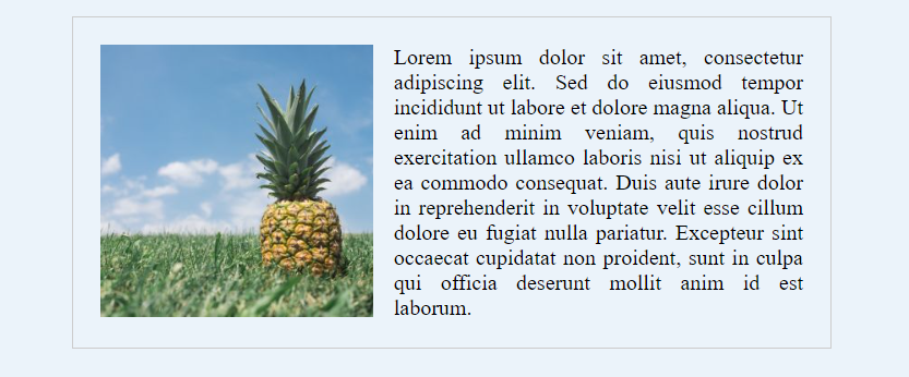
Lorem ipsum dolor sit amet, consectetur adipiscing elit. Sed do eiusmod tempor incididunt ut labore et dolore magna aliqua. Ut enim ad minim veniam, quis nostrud exercitation ullamco laboris nisi ut aliquip ex ea commodo consequat. Duis aute irure dolor in reprehenderit in voluptate velit esse cillum dolore eu fugiat nulla pariatur. Excepteur sint occaecat cupidatat non proident, sunt in culpa qui officia deserunt mollit anim id est laborum.
</p>
</div>
</body>
</html>output:
Explanation:
- The float: left property is applied to the image, causing it to float to the left.
- The text wraps around the image because of the float.
- margin-right is used to add space between the image and the text.
3. Clearing Floats
When elements are floated, they are removed from the normal document flow, which can cause layout issues. For example, if a container has only floated elements, it may collapse because it doesn’t recognize the height of its children. To fix this, you need to clear the float.
Full Code Example:
<!DOCTYPE html>
<html lang="en">
<head>
  <meta charset="UTF-8">
  <meta name="viewport" content="width=device-width, initial-scale=1.0">
  <title>Float Example: Clearing Floats</title>
  <style>
    /* Basic reset */
    * {
      margin: 0;
      padding: 0;
      box-sizing: border-box;
    }

    /* Container styling */
    .container {
      width: 80%;
      margin: 20px auto;
      padding: 20px;
      border: 1px solid #ccc;
    }

    /* Floated boxes */
    .box {
      float: left; /* Float boxes to the left */
      width: 30%; /* Set width for each box */
      margin: 1.5%; /* Add some spacing between boxes */
      padding: 20px;
      background-color: #f4f4f4;
      border: 1px solid #ddd;
    }

    /* Clearfix hack to clear floats */
    .clearfix::after {
      content: "";
      display: table;
      clear: both;
    }
  </style>
</head>
<body>
  <div class="container clearfix">
    <div class="box">Box 1</div>
    <div class="box">Box 2</div>
    <div class="box">Box 3</div>
  </div>
</body>
</html>output:
Explanation:
- The
.boxelements are floated to the left, creating a multi-column layout. - The
.clearfix::afterpseudo-element is used to clear the floats. It ensures the container recognizes the height of its floated children.
4. Modern Alternatives to Float
While float is useful for simple tasks, modern CSS tools like Flexbox and Grid are better suited for creating layouts. Here’s an example of how you can achieve the same multi-column layout using Flexbox:
Full Code Example:
<!DOCTYPE html>
<html lang="en">
<head>
  <meta charset="UTF-8">
  <meta name="viewport" content="width=device-width, initial-scale=1.0">
  <title>Modern Alternative: Flexbox</title>
  <style>
    /* Basic reset */
    * {
      margin: 0;
      padding: 0;
      box-sizing: border-box;
    }

    /* Container styling */
    .container {
      width: 80%;
      margin: 20px auto;
      padding: 20px;
      border: 1px solid #ccc;
      display: flex; /* Use Flexbox */
      justify-content: space-between; /* Space out the boxes */
    }

    /* Box styling */
    .box {
      width: 30%; /* Set width for each box */
      padding: 20px;
      background-color: #f4f4f4;
      border: 1px solid #ddd;
    }
  </style>
</head>
<body>
  <div class="container">
    <div class="box">Box 1</div>
    <div class="box">Box 2</div>
    <div class="box">Box 3</div>
  </div>
</body>
</html>Explanation:
- The
display: flexproperty is used to create a flexible layout. justify-content: space-betweenspaces out the boxes evenly.
Conclusion
CSS float is a powerful tool for wrapping text around images and creating simple layouts. However, it can lead to layout issues if not managed properly. Clearing floats using techniques like the clearfix hack is essential to avoid these issues. For modern layouts, consider using Flexbox or Grid, which are more robust and easier to manage.